How to Make Cute Christmas and holiday Gnome, Gnomes, Christmas Gnomes, nisse, tomte, tomtenisse, tonttu, Scandinavian

What a great time I’ve had making these Gnomes even some for the fall season with leaves and spiders in the beards and hats.

Three handmade Gnomes.

I made the two on fall themed Gnomes using wood blocks I found at Micheal’s during the fall season decor display. I painted them a solid color and then painting a fall leaf pattern from a template on the front and back (sorry, don’t have a picture of that). I purchased about a 1/4 yard of the two different furs for the beards (I needed at least that much for the length to cover the wood block which is 9” x 6” x 1”). In order to determine the length and width of the beard, I laid the fur over the painted wood block and dipped in down a little to allow for where I planned to place the nose before I cut the fur. Once I cut the beard, I hot glued it to wood block in a half circle shape leaving room for the nose.

The nose is made from a flesh colored hose. I had to guess how large I would need to cut the circle from the hose so I stuffed a bit of poly-fill a little at a time holding my thumb and fingers around the hose until I got a shape that fit the size of the gnome. Then I cut the circle out of the hose and used a needle and doubled the thread, knotted the end of the thread to stitch around the edge of the circumference of the circle. Once the circle was stitched, I began to gather the circle together by pulling the thread against the knotted end while stuffing with poly-fill as I went along until it looked like a big, bulbous nose fit for a Gnome! I secured the thread by wrapping it several times around the base and tied it off, then hot blued it to the wood block just above the beard.

Now comes the hat. As I was checking out at the fabric store (I believe it was Joann’s) I saw a display of knee length fall patterned socks and purchased two sets. I took one sock from the fall leaf pattern and stuffed it with poly fill until it could be placed over the top of the wood block and able to stand upright. Since the socks have a maroon-colored toe, I hand stitched around the edge of that portion while pushing the poly-fill up into that area to form a ball at the top. Then wrapped yarn around the top, added a bell and a wood leaf decor that came with the fall wood block. I slipped the sock over the block and it held without having to be glued! yeah!

On both Gnomes, I used the same brown and white yard to wrap around the hat and hot glued it to the top - be flexible here and use whatever you have available . I then hot-glued a length of white faux fur around the edge of the hat on one of the Gnomes. The gnome with the white pom-pom - I first cut off the maroon area of the toe and stitched the hat together so the filling wouldn’t come out before I placed it onto the wood block. I purchased a pom-pom maker and made a white pom-pom (ready made pom-poms would work) for that gnomes hat and securely stitched it onto the top of the hat. (note:I stuffed the hats with poly-fill to keep them standing upright).

The feet are two felt pieces cut to a 2 1/2” oblong oval (like the shape of a shoe) then cut in half (I didn’t want them on the bottom of the block because it wouldn’t stand up straight. I sandwiched two of the felt pieces together, and as I saddle stitched around the outside edge. I lightly stuffed with poly-fill (that’s one shoe- repeat for second shoe). I hot glued them to the wood block by folding a slight 1/4” of the shoe up at the back, creasing it with a warm iron and then hot glued it at the front of the bottom of the base (not underneath). To finished I added , bells, wood leaf and spiders for a little added fall decoration.

The gnome with the red hat is from a pattern I found on Etsy (shop name is Happy Heart Patterns).

Found these at Micheal’s. Removed the decorations, painted the front and back (but you could skip that step if you liked them just as they are. The beard covers the front anyway.

The Gnome on the aspen log I made from a patter I found on Etsy. The other I created using a styrofoam cone.

This guys has a burgundy hat made from a sock, his body is a blue, red and white plaid flannel. I used a 1/4” wide length of leather to wrap around his hat and embellished with a bell then tucked a small, Christmas branch decor into the crook of his arm.

Gel Arts and Mono Printing

Monoprinting is a form of printmaking that has images or lines that can only be made once, unlike most printmaking, where there are multiple originals. There are many techniques of monoprinting. Examples of standard printmaking techniques which can be used to make monoprints include lithography, woodcut, Gelli Art Plate, and etching. A monoprint is a single impression of an image made from a reprint able block, but with the Gelli Arts plate, stamping and "ghost prints” are also an added addition to the traditional mono printing process.

The beauty of this medium is also in its spontaneity and its combination of printmaking, painting and drawing media. With this process, no two prints are alike; although images can be similar, editioning is not possible. Each piece is original.

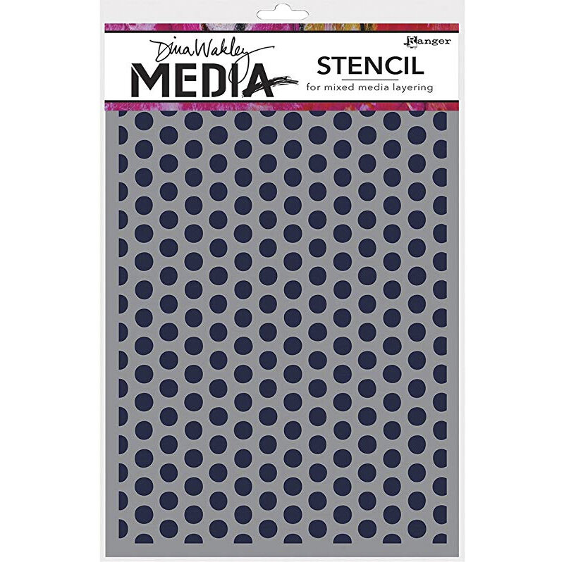
This is a mixed media piece where I’ve created a background using templates of dots and the inside of torn apart cardboard. The print dries quickly when you use acrylic paint so you need to work quickly. Etsy shop

Deer Skull and Snow Flakes - Mixed media - mono print, ink, digital

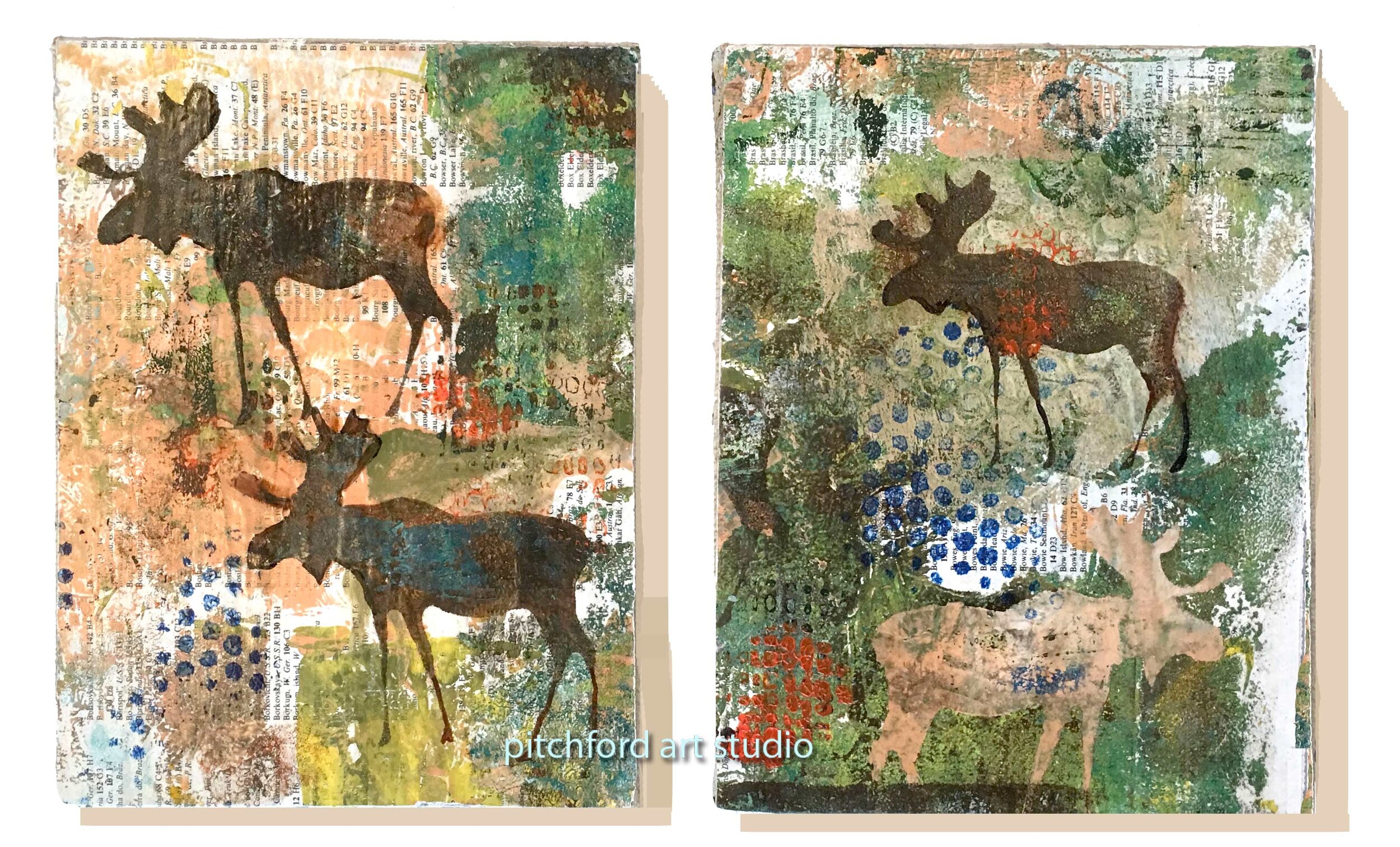
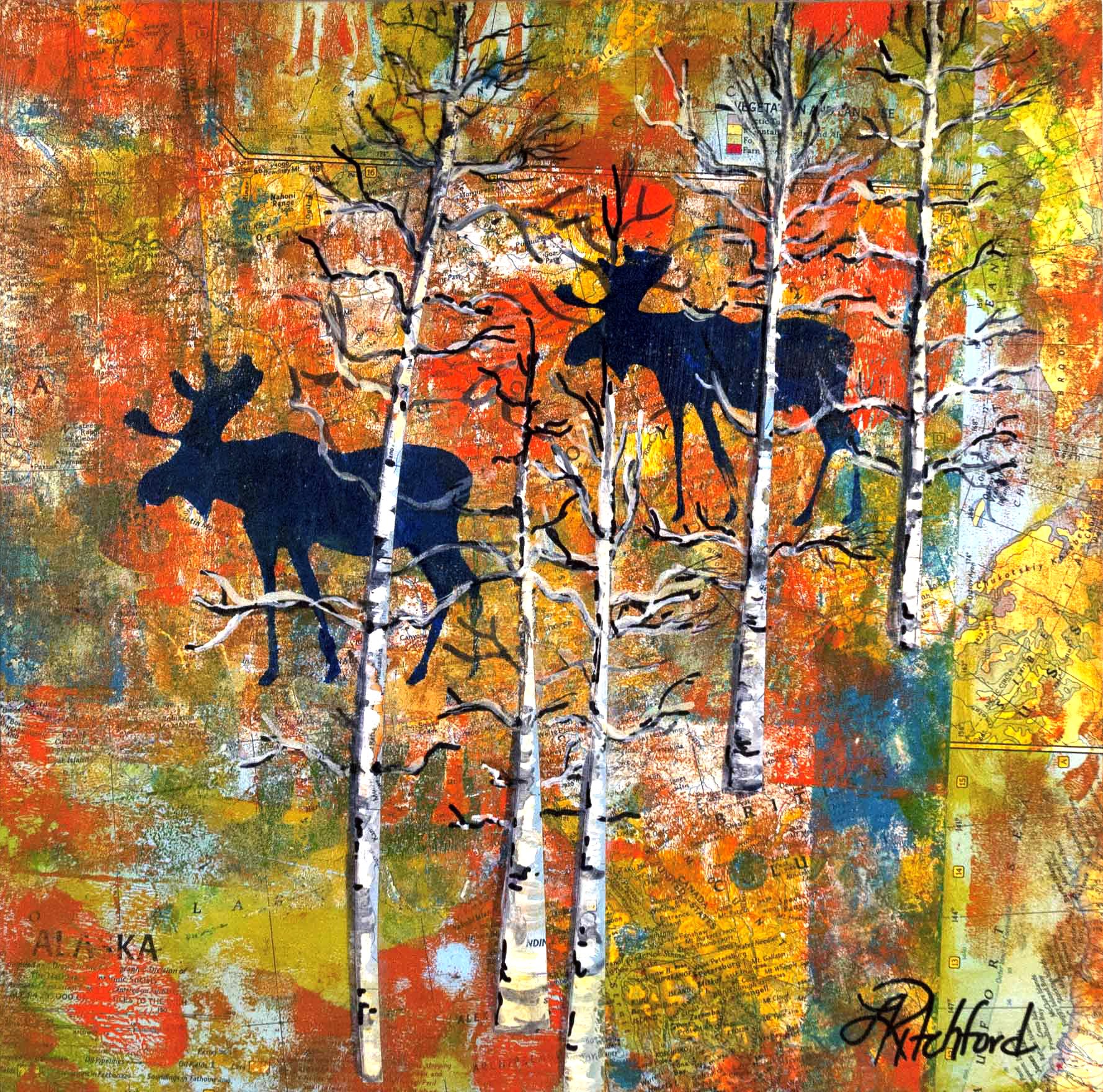
Moose on dictionary paper- Mixed media - mono print, ink

geli-2.jpg
geli-1-cardboard.jpg
Brayer to roll out the paint

Brayer to roll out the paint

geli-plate.jpg
1 - old rolling pin with strips of foam in various widths glued onto it. 2- paint foam roller. 3 - brayer with foam wrapped around it. 4 - foam paint roller with the foam cut into three pieces and slid back onto the roller. 5 - brayer with cord twis…

1 - old rolling pin with strips of foam in various widths glued onto it. 2- paint foam roller. 3 - brayer with foam wrapped around it. 4 - foam paint roller with the foam cut into three pieces and slid back onto the roller. 5 - brayer with cord twisted around it. 6 - brayer. 7 - small foam roller.

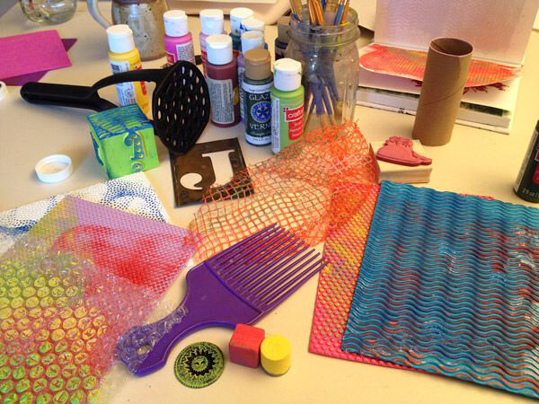
So many different material can make unusual and interesting marks on you rolled out paint. For instance wide toothed comb, empty toilet roll, potato masher, templates, vegetable wrapper, styrofoam dots…. Be creative!!

So many different material can make unusual and interesting marks on you rolled out paint. For instance wide toothed comb, empty toilet roll, potato masher, templates, vegetable wrapper, styrofoam dots…. Be creative!!

Here are some tips and tricks I've learned while using the Gelli plate.

Moose on map gelli prints

#1 - The best tip I can recommend is to take good care of your Gelli plate. READ the instructions and follow care instructions carefully and the Gelli plate will last for years. You can purchase the Gelli Plates at most crafts stores. I’ve found them at Micheals, Joanns, Blick Art Supplies and online. Gelli Arts cautions not to use any glossy paper stock, including photo paper. It can stick to and damage the surface of the gel plate. In addition, the gel printing plate has an extremely sensitive surface and will imprint any texture it is siting upon. It is recommended to always keep your gel printing plate laying flat on a smooth, flat, nonporous barrier such as a Teflon baking sheet, baking tray or piece of glass. I simply use the sheet of thin, rigid plastic that came with the Gelli Plate. Read the instructions from your Gelli plate. Your Gelli Arts plate can be expensive to replace especially if you have the larger 12 x 14" which is roughly $62.99.

#2 - The substrate matters. (substrate is the base material onto which images will be printed). Paper (lightweight, heavyweight, coated, uncoated, paperboard, cardboard, etc.) including parchment. You can also use fabric, foils and wood. I've found a medium weight paper around 120 lbs hold up well and can be used in other projects like collage or jewelry. But the parchment papers transparent quality make amazing and interesting collage additions as well. The exciting part of mono printing is the experimentation because even with careful planing your will always get surprises and most are happy surprises as in the mono-print below.


Paper

Hollander carries a wide selection of papers coated and uncoated (surface coat is added). Coated papers can often resist paint but don't simply discount this paper if you have it on hand. It's just needs to dry a little more between coats of paint. The surface may have more sheen as well and doesn't really work with the Gelli Arts plate. It can also possible damage the surface so I recommend starting with computer paper or card stock as you learn and then graduate to printmaking paper. Our local craft and art stores carry the heavy Bristol paper and Staples #110 Cardstock for an economical heavy paper is another great choice. Rives BFK (about $7.50 a sheet) or Rising Stonehenge ($3.25 for 22" x 30") are excellent printmaking papers for fine prints. For collage, I love using deli paper (here's a blog that has images of prints on deli paper. I found Costco carries dry waxed paper sheet in bulk and they work very nicely. Also here (dry waxed paper). The deli paper is wonderful for it's thin, translucent properties. Paper is such an individual preference, and your end purpose will be a factor in your paper choice but I would note that a smooth-surfaced paper gives a more detailed print.

Fabric- Gelli printing is perfect for monoprinting on fabric. Tight-weave fabrics, such as PFD cotton and muslin, give great results.

Paint

Acrylic paint is stellar for gel printing! Although a little warning that it dries quickly and forces you to make quick decisions about pattern. I recommend sorting out your templates and mark making tools in advance of rolling out the paint. Laying the paper on top of the design, pressing with your hands to make the design stick to the paper and then and pulling it off the plate is quite exciting but if the paint dries to much before this effort is accomplished the paint won't all adhere to the paper. However, do despair too much because you can spread more paint thinly and bring up a ghost print of the previous design. That can often be where the gel prints are the most interesting.

Liquitex Basic acrylic paint has a great color selection and is relatively inexpensive. Some of the colors are more saturated than others like the Quinacridone Magenta which runs about $4.49 for one and for 3 or more $3.44 in a 4oz tube at Blick Art Supply. I've also found a variety of paints in the clearance section at my craft store that are priced around $.25 for a small 2oz tube. Sometimes they need to be revived with a little water as the paint has sat a little too long and has started to coagulate. At those prices the paint can be a wonderful source of experimentation as you can mix the colors to create additional shades.

The creative and fabulous artists at Gelli Arts have made some wonderful video instructions and I've included the one above that creatively uses the smaller Gelli plate in the 3" x 5" size for stamping $11.69 at Blicks

How to care for your fine art prints

HOW TO TAKE CARE OF ART PRINTS


A large, conspicuous, and noisy bird of the Pacific Coast, the Black Oystercatcher can be found along rocky shores from Alaska to Baja California.

All my prints are printed on a variety of high quality fine art papers with a heavy weight of 310 to 340 gsm or Grams per Square Meter. It is important to understand that the quality after purchase is highly dependent on the long-term care of this product. When you purchase from me the print comes with an  archival sleeve for this reason. Once removed from this bag, We no longer takes responsibility for the prints overall longevity. Be sure to store it in a sealed frame, away from heat (ultraviolet rays in sunlight can cause fading), and in a place w/ controlled humidity.

You may or may not know this, but more art prints are destroyed by the lack of knowledge about the proper care and conservation of them than any other means. This is why it was important for me to put this page here for you, a patron, so that you can have a quality print on your walls for a long time! If a print is not handled and cared for properly, the condition and look of your art print will diminish much faster than you could ever imagine. So how do you preserve the quality of your art print? The following will help you preserve them MUCH, much longer!

FIRST LETS TALK ABOUT WHY YOU NEED TO PROTECT YOUR PRINTS:

Art prints are a recreation, whether the original was digital or done by hand, what you now have in your possession is a printing of that original, on quality paper. The important thing to now realize is that this print, is in fact on paper, regardless of how nice and fancy it looks, paper has properties to it that are important to understand. Paper has a tendency to be fragile; it can wrinkle, tear, and bend, so it needs to be handled with care. Aging of a print is a natural chemical and biological process, that is supposed to happen in nature but this isn't nature now is it? So, we have to stop that from happening. There are other environmental factors, other than just the paper having aging issues that affect prints longevity. Such factors include, but are not limited to pollution, light, heat, humidity, smoke, cooking fumes, dust and air circulation. If you follow these handling and care precautions to prevent your print from showing signs of deterioration from mishandling, you SHOULD BE happy with you prints for a very long time!

Important Notes:

Do not remove print from archival sleeve provided until you are ready to frame! When handling your print, treat it as if you were a museum curator; touching only the edge of the paper, and gently placing it in/out of frames. Consider where you place your print as an important part of preservation. Do not place in direct sun light or near any heat/water source. Extreme temperature fluctuations cause expansion and contractions of paper and can cause a rippling effect on prints that are not surfaced mounted and protected by glazing. Use acrylic plastic glazing to cover your print in the frame, instead of glass because it is lightweight, it causes no condensation and acrylic plastic is offered with ultraviolet light absorbers. Prints should never have any direct contact with the glass or other glazing. Always use a window mat with frame. *Use only 100% acid free mounting and matting materials. 

Remember to read everything on this page to have a FULL understanding of how to protect your prints!

The list above is just provided to give you a starting point as to how to care for your prints. The following is a more in-depth explanation of how to and why you should protect them.

THE ART PRINT'S ARCH-NEMESES

SUNLIGHT & INDOOR LIGHTING

Where you hang your print WILL have a major impact on its longevity! You should never hang your prints in direct sunlight, regardless of the type of protection/framing used. The reason is, the colors of your print can become completely faded out due to exposure of light. Remember, the print was printed with chemicals; chemicals change if the right environments are provided. Exposing prints to direct sunshine or artificial light from bulbs or fluorescent lighting is one of the worst and most frequent mistakes made by art patrons.

Much like your skin, your prints need UV protection. Pesky sun! That being said, you should use UV acrylic or glass frames to minimize the effects of harmful ultraviolet rays. Do not place lamps too close to art prints and Keep them away from direct heat sources. For example, light from light bulbs produce heat! Have you ever touched a light bulb after turning it off? IT'S HOT! Bulbs like these can damage the print! Knowing that, consider this: Most light bulbs in your house will range from 30-60watts; so the average 40 watt bulb should be no closer than 18 inches to the print.

HUMIDITY & HEATING

Humidity causes molding and discoloration spots. Storing art prints in a basement with high humidity and without air circulation will inevitably cause damage. Humidity tends to attract pests, which will inevitably cause damage to them.

During winter months, humans hate the cold, so we often overheat the house and the humidity is too low. Relative humidity should be between 40% and 60%. Having plants in the house that you water will increase the humidity or place bowls with water near heating sources or radiators. Your art works on paper and antique furniture will appreciate it. Basically, don't put them in overly humid places and don't cook them with your heaters either!

BATHROOMS

If you use prints as decor for your bathrooms, you should buy acrylic plastic glazing along with having the back of the print sealed so moisture doesn't touch the print. For many reasons, you should always have good ventilation in areas with high moisture. Moisture is not a friend of paper, try putting a piece of paper in your bathroom, take shower, and look at the paper again, after a week of doing this, it will wrinkle and look like an old man in no time! In all honesty, bathrooms aren't the best place for art prints regardless of the nature of some prints, which feel suited for a bathroom. If you have the expectation to preserve the print for longer than well, a short time, just don't put them in there, or you may need to replace them every year or so.

HEAT & TEMPERATURE

Extreme temperature fluctuations cause expansion and contractions of paper and can cause a rippling effect on prints that are not surfaced mounted and protected by glazing.

Do not hang an art print over or near heating sources or directly next to or over heating air ducts. Most homes and businesses have each room heated and sometimes in the winter months, over-heated. A permanent humidity below 40 percent will dry out the paper and make them brittle. Museums keep a constant temperature in their exhibition rooms.

OVER FIREPLACE

It is not generally recommended hanging picture art over fireplaces. Before you do, check these items carefully. The heat is directed out towards the room and not flowing upward, there is no smoke particles being released around the fireplace and check for excessive heat next to or above the fireplace. Watch the humidity in the home and hang art prints that have glazing to protect the prints.

POLLUTION

Indoor pollution that affect art prints are from acids in papers and furniture, carpets, paints, dust and dirt, among many other particulate materials or chemical fumes. So keep it AT LEAST in the plastic bag, which was provided to you at purchase.

HANDLING & Storing Fine Art Prints

A lot of publications will tell you to not to touch art prints with your hands and wear white cotton gloves. Sounds good, but how many people will have or will use white cotton gloves? So, be aware that the oils and contaminants on your hands will attack the print and cause discoloration and/or fading over time. What you can do is wash your hands thoroughly or put on the light, tightly fitting surgical gloves before handling prints. Whatever you do, do not get fingerprints on the image area of the print, the mount board or the mat.

Always lift the print by opposite corners (for example, top left and bottom right), letting the print gently bow or sag in the middle. Un-mounted prints and posters are vulnerable to crescent moon-shaped creases. Be careful to avoid dents and creases, since these can be very difficult or impossible to remove later

Treat your fine art print as if you were a museum curator. Handle them very carefully; your fine art print will reward you with a long life.

Very important for art collecting never trim off the borders of the art print, this area is used for handling, it's the portion you place under the matting or frame so no materials ever touch the actual printed portion, and it's where you would find or have artist signatures.

STORING PRINTS

Most of us are not storing or saving our prints professionally, we want to frame them and hang them up for show. Occasionally, we will need to store, move or ship them and prints are often damage in storage or transporting them.

For home or office storage To store keep the print in its mounted frame. If you have loose prints, they should never be stored where the face of two prints is in direct contact with each other. Put each giclee art print into a separate folder of acid-free paper and store them in a horizontal position.

You should check the placement of your prints regularly for insects. Wormholes or worm tracks caused by silverfish or other pests will destroy the aesthetic look and financial value of your fine art prints.

Glazing is important to protect the print from various types of damage resulting from sources such as smoke, ozone, cooking fumes and human touch or being abraded.

Should you use normal glass or acrylic glazing? Glass can be less expensive but heavy and will glare unless you get the non-reflective kind or museum quality glass. The non-glare glass is not one hundred percent clear and will make your print look fuzzy and affect the ability to see the details in the print. Many believe that glass with non-glare elements, even museum glass will affect the clearness of the picture.

Some will say that Acrylic plastic (high tech protective panes) are considered by most the best solution. It causes no condensation and acrylic plastic is offered with (UV) ultraviolet light absorbers. These high-tech protective panes provide a crystal-clear cover for your print, along with the added benefit of UV ray shielding. They are half the weight and 4-5 times more impact-resistant than standard framer's glass. In the rare occasion that it does break, acrylic glazing is shatter resistant and therefore much less likely to damage your artwork or cause injury.

Others will say that Glass is best but only if you get the more expensive thin museum glass. Glass is easy to cut, chemically inert, and resistant to scratches. Museum style glass has a transparent, anti-reflective coating that makes it nearly invisible. This is not the old-style frosted glass that was used to reduce glare. Museum glass has a coating similar to what is used on modern camera lenses. The coating minimizes reflections, making the glass very difficult to see. If you've ever seen a print under glass where the glass was almost invisible, you've seen museum glass.

If you live in an area prone to earthquakes or you have a larger size print you may prefer the acrylic glazing.

MOUNTING & MATTING ART PRINTS

RECOMMENDATION: It is recommended to have the print professionally dry mounted and matted with archival quality, acid-free materials.

Use only 100% acid free mounting and matting materials.

Be sure the mat separates the print from the glazing. Prints should never come in contact with or touch the glazing. You can use a 4-ply mat for prints up to 16 x 20 prints or use an 8-ply or double mat for larger prints to protect them from bowing and accidentally touching the glazing.

Larger prints need more stiffness support to keep them from bowing in the middle over time and touching the glazing. You can always use an extra layer of 100% acid free foam core attached to the back of the mount board on prints larger than 16 inch x 20 inch.

Use of tapes to fix print. Art galleries, dealers and framers may use special adhesive tapes, called archival tapes, to fix the print to the mat. This is not damaging to your print, but it may dry out within several years and possibly shift or fall off. Avoid using tapes if at all possible.
 

CLEANING PICTURE GLAZING (ACRYLIC OR GLASS)

Simply dust the frame and protective acrylic glazing with a soft rag or fine duster to remove surface dust. Clean the glazing surface regularly with the proper cleaner. CAUTION Spray the appropriate cleaner on a soft cloth first not the surface of the framed piece, to avoid pooling and damage to the frame, mat, and art.

To avoid damage to your acrylic glazing, do not use abrasive soaps or any commercial glass cleaner that contains ammonia or alcohol. Wipe the surface gently with a slightly moist sponge or soft rag. Dry with a soft, lint-free rag. Do not wet or clean the print directly. With a minimum of care, your custom-framed art print will provide you with a rewarding viewing experience for many years to come.

Much of this information was borrowed from Epson’s vast knowledge on caring for prints along with other Google searches and combined here for your ease in understanding the care of your archival prints.

I understand this information is not going to apply to every print someone owns or purchases. Vintage frames are sometimes the perfect fit for what your decor vision is and my prints are reasonably priced so go nuts and don’t worry too much about archival - but I do want to provide the consumer with the knowledge to make their own decision about how they will determine to care for the printed artwork.

Thanks for stopping by - my print shop can be found at this link Pitchford Art Studio on Etsy


Drawing with graphite

Most of us remember the bright yellow pencil we started with to make marks and learn writing and arithmetic skills. It had the handy little eraser on one end and my favorite part was being able to sharpen it. Sticking the pencil into the sleek chrome pencil sharper with the crank on the other end and winding it around and around, periodically checking its sharpness is a fond memory.

This TED video on YouTube "Why the pencil is perfect" might ignite the artist in you and perhaps bring new light to the ordinary pencil.

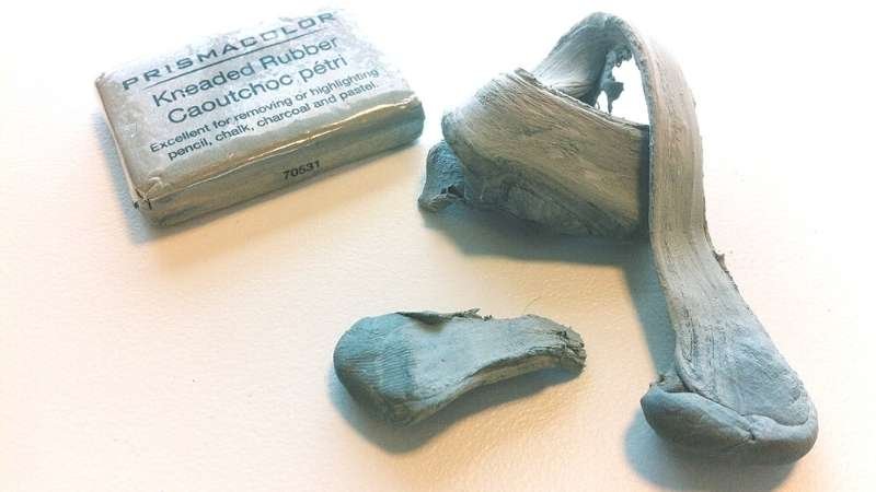
Rather than a permanent mark like a pen the sweet little pencil allows mistakes and corrections to occur. The  eraser on some pencils is such a weird color like -hmmm pink, flesh color, puce (what's that color?) and sometimes it just makes the erasure worse leaving behind impossible to remove graphite streaks. So pick up a kneader eraser when your creating you drawings to remove any errors, works much better and you will like the silly putty feel of it and kneading process. 

I find the octagonal shape of the pencil to be a plus and a minus. The many facets of the octagon help hold the pencil firmly but lets not grip so hard we create calluses so loosen the mind and loosen the grip. 

Ever wonder which pencil is best for your needs? Lets examine a few options starting with the hardness of the graphite inside the pencil. 

Historically, pencil manufacturers use a numeric score and a letter on their pencils. The number indicates the hardness of the graphite (how much clay is added) and the higher the number the harder the core which equates to a lighter mark.

The second graphite grading scale is known as the HB scale (H, HB, B 2B etc). Most pencil manufacturers outside of the U.S. use this scale, using the letter “H” to indicate a hard pencil. Likewise, a pencil maker might use the letter “B” to designate the blackness of the pencil’s mark, indicating a softer lead. The letter “F” is also used to indicate that the pencil sharpens to a fine point.

Source: Pencils.com

Source: Pencils.com

GRAPHITE SCALE COMPARISONS

Generally, an HB grade about the middle of the scale is considered to be equivalent to a #2 pencil using the U.S. numbering system.

I like to use either a Tombow 4H or the Staedtler/Mars-lumograph drawing pencil 3H

In reality however, there is no specific industry standard for the darkness of the mark to be left within the HB or any other hardness grade scale. Thus, a #2 or HB pencil from one brand will not necessarily leave the same mark as a #2 or HB pencil from another brand. Most pencil manufacturers set their own internal standards for graphite hardness grades and overall quality of the core, some differences are regional. In Japan, consumers tend to prefer softer darker leads; so an HB lead produced in Japan is generally softer and darker than an HB from European producers.

Because H pencils are harder, they will leave a lighter graphite trail on the paper.

  • On the other hand, B pencils leave a darker trail, because they are softer.

  • F stands for Fine. It is a type of pencil that’s easy to keep sharp, but also one that’s hard. It’s rather difficult to draw with this type of pencil if you’re a beginner (but also good for tracing or pre water color painting.

  • HB pencils are right in the middle of the scale. They are also considered to be hard for drawing.

  • The number that comes with the letter is also an important hint that will tell you a lot about the darkness/lightness of a pencil. For example, a pencil that has more Hs is harder compared to one with less Hs, which also means it’s lighter. In other words, the 9H pencil is the hardest one out there, but also the one that leaves the lightest trail.

  • Consequently, if a pencil has more Bs, it is softer, and will, therefore, leave a darker trail. That means that a 7B pencil will leave a darker mark compared to a 3B one.

Staedtler/Mars - Lumograph Drawing Pencil - 3H - good for drawing out your water color painting.

The best type of pencil to use for watercolor painting is a sketching pencil with hard lead, generally between 9H and 4H (according to the figure above) , or to avoid sketching at all. If you choose a pencil that is too soft, it will be hard to erase before water coloring. If you choose a pencil that is too hard, it could damage your paper.

Finding what works best for your own artistic and writing needs is generally a matter of personal preference and experimentation with different brands of pencils.

At first, you’re eager to draw and will use just about any piece of paper you can get your hands on to do so. However, you should know that the texture of the paper you use has a huge impact on the final result. Certain effects are easier to achieve when the paper has the right texture. The paper’s texture is often known as the tooth of the paper. A rougher tooth is more visible, so the paper will best catch the graphite from your pencils. If the texture of the paper is smooth, your pencil will have less grip.

The navigation of Sea Turtles

Sea Turtle Navigation - purchase here: https/etsy.com/shop/pitchfordartstudio

Sea Turtle Navigation - purchase here: https/etsy.com/shop/pitchfordartstudio

This original watercolor "Sea Turtle Map" was developed when I read about the navigational skills of the many animals including the sea turtle who use earth's magnetic field as a map for traveling thousands of mile across the oceans to return to their birth place. I've painted imaginary navigational symbols using the geometric shapes that make up the sea turtles shell, adding my humble imaginings of the navigational map Sea Turtles use to find they way back to their familial beginnings. I wonder if its similar to how the stars are used to navigate the oceans. 

In Chinese mythology, the sea turtle represents wisdom. In Hawaii, legend tells about a green sea turtle, Kauila, who could change herself into a girl to watch over the children playing at Punalu'u Beach on the Big Island. When Kauila's mother dug her nest, a fresh water spring surged upward, quenching the children's thirst. 

For centuries, determining longitude was an extremely difficult task for sailors, so difficult that it’s been thought improbable — if not impossible — for animals to do it.

But migratory sea turtles have now proved capable of sensing longitude, using almost imperceptible gradients in Earth’s magnetic field.

“We have known for about six years now that the magnetic map of turtles, at a minimum, allows turtles to … detect latitude magnetically,” (biologist Ken Lohmann of the University of North Carolina)

Lohmann specializes in animal navigation, and work from his laboratory and others have exhaustively demonstrated how sea turtles — along with many birds, fish and crustaceans — use gradients in Earth’s magnetic field to steer.

Those differences, however, are far greater by latitude than by longitude. Travel north or south from Earth’s magnetic poles, and their pull weakens noticeably. Travel straight east or west, and the pull doesn’t change. Instead the pull’s angle changes, and only to an infinitesimally slight degree.

That turtles and other migratory animals could detect such a small change was considered unrealistic, but experiments on animals released in out-of-the-way locations repeatedly described them finding home with unerring accuracy and efficiency, explicable only as a product of both longitudinal and latitudinal awareness.

Several nonmagnetic explanations were proposed, foremost among them a “dual clock” mechanism analogous to human methods of calculating longitude, which sailors perform by comparing precise differences between the time locally and at an arbitrary longitudinal line, such as the Greenwich Meridian. No such mechanism has been found, however, and longitudinal differences in local airborne or waterborne chemicals don’t seem to explain animals’ uncanny long-distance steering.

“A skeptic could reasonably believe that the latitudinal cue is magnetic, but that determining east-west position depends on magic,” wrote James L. Gould, a Princeton University evolutionary biologist, in a 2008 -  "Current Biologycommentary on animal navigation."

In the new study, researchers led by Lohmann and graduate student Nathan Putnam, also a UNC biologist, placed hatchling loggerhead sea turtles from Florida inside pools of water surrounded by computer-controlled magnetic coil systems.

By varying the currents, Lohmann and Putnam could precisely reproduce the geomagnetic characteristics of two points at identical latitude, but on opposite sides of the Atlantic. Into each pool they placed the hatchlings, which in the wild would instinctively follow a migratory path from their home beach and into the currents that circle the Sargasso Sea and loop around the Atlantic.

In the first pool, programmed to the geomagnetic field in the western Atlantic near Puerto Rico, the turtles swam northeast, on the same trajectory as loggerheads in the wild at that locale. In the other pool, set to the geomagnetics of the eastern Atlantic near the Cape Verde islands, the turtles swam northwest.

No other cues could explain their directions. Against reasonable expectation, the turtles clearly sensed differences in geomagnetic angle.

Gould, who was not involved in the study, wrote an accompanying commentary. Whereas his earlier article was titled “Animal Navigation: The Longitude Problem,” this was called “Animal Navigation: Longitude at Last.” The findings are “the final piece of the puzzle,” he wrote.

Lohmann now plans to study whether currents affect the turtles’ longitudinal compass, and whether the turtles detect differences over short distances. He also suspects that other animals may have a similar longitudinal compass.

“The mechanism we’ve found in turtles might also exist in birds,” he said.

Citations: “Longitude Perception and Bicoordinate Magnetic Maps in Sea Turtles.” By Nathan F. Putman, Courtney S. Endres, Catherine M.F. Lohmann, and Kenneth J. Lohmann. Current Biology, Vol. 21 Issue 4, Feb. 24, 2011.

“Animal Navigation: Longitude at last.” By James L. Gould. Current Biology, Vol. 21 Issue 4, Feb. 24, 2011.

“Magnetoreception in an Avian Brain in Part Mediated by Inner Ear Lagena.” By Le-Qing Wu and J. David Dickman. Current Biology, Vol. 21 Issue 4, Feb. 24, 2011.


Source: https://www.etsy.com/