To create a travel kit that will hold your paint, pencil, brushes and water start with a small travel pouch with pockets - I found a small makeup travel purse that had pockets to hold brushes and it works nicely for a watercolor travel kit. But it can be as simple as reused mint and candy tins. For water I use a small bottle I found in a hotel room initialing filled with shampoo. I cleaned it out as a small water container. It fits in the kit nicely and doesn't leak. I used small bottle lids that fit into the tins and filled them with primary colors for my palette - red, yellow and blue - plus I also like to carry a paynes grey and cobalt blue. I have a couple Elegant Writer Pens in this kit, two regular travel brushes, one brush that holds water in the handle and a small mechanical pencil as well as a pen with permanent ink. A purse size packet of tissues complete the set.

Altoids can, the paint is squeezed into water bottle lids - stick with red, blue, yellow and one darker and another of your favorite color.

How to make a watercolor travel kit

I found this kit online here Creativity Journey

Small plastic palettes available at most art stores.

Another great site showing instructions for creating a watercolor travel kit
Recycled Altoids cans make handy, small yet convenient hard case for carrying around your watercolors. I also like that the lid can be used to mix colors. Happy painting.
links to travel kit instructions:
http://www.lifeneedsart.com/blog/new-mini-watercolor-palette/
http://lekgunsketchbook.blogspot.com/2010/12/my-small-water-color-set.html
http://threestarowl.com/art/tweaking-tiny-tins-making-mini-watercolor-kits-from-mint-boxes
Watercolor process:
I'm often asked about the watercolor process and where to start. Watercolors, for the most part, have a loose, impressionist feeling about them leaving the viewer to fill in any missing details. The image below of a Black Oyster Catcher was created loosely in a small journal I carry around with a traveling watercolor kit and a couple of brushes. I also have a few color ink pens and a pencil (9h) to draw out a quick sketch. When your model is a wild creature they don't tend to be stationary and you've got to be quick to caption the impression of them. The trees and background in the below image were added later. It takes practice and patience. Rome wasn't built in a day.
Be gentle with any initial harsh judgements and don't expect to have a perfect watercolor from these first practices. Perhaps start with a still life - a coffee cup, piece of fruit or vegetable that is stationary. Make a loose drawing of it and then fill in the watercolor with loose strokes varying the intensity of the color for shading to give the image interest. Edges are important and I like to fill my brush with plenty of color and push the water and suspended color to the edges creating shadows or defining a shape. You'll notice the seals below has more intensity of where I want the darker shading. Also, rather than using black, I used Payne’s Gray (Payne’s grey is a dark blue-grey color. It can be used as a mixer in place of black. Being less intense than black, it is easier to get the right shade when using it as a mixer), which in my mind is more pleasing then using black although the bird is called a "black" oyster catcher. The trees and background are lighter in color and help to recede into the background. The same with the foreground so as to bring attention to the main focus of the painting.
Nature will present the most alluring color combinations so try to find that in your color palette. We all remember that mixing red and blue makes purple, yellow and blue makes a green and so forth. When your traveling with a limited number of colors and you want to remember the scene when you return to your studio, take a picture as a reference. I know, that’s a lot going on when the subject may take flight in just seconds but as you practice you'll improve I can assure you of that! I can't describe how terrible my first attempts of painting in plein air were. My professors adhered to the notion of practice, practice, practice and I would recommend that as well.
Remember that spots of bright and darker colors should be harmonious and not distracting. It can create harmony by repeating a bright color but keep it subtle. Fine edges in a loose watercolor painting should be kept to a minimum as they too draw attention. If you'd like to add lines to define the image adding or starting with a pen drawing as shown in the journal below is a great way to go. However, it takes a great deal of practice and not getting discouraged. Remember its a process, slow down and enjoy the creative meditative place it can take you too.
Try your best not to fill in all the details - watercolors are intentionally loose.
Stay with harmonious color combinations (use nature to help you decide).
Cut a piece of cardboard into about the size of your journal and then cut an additional section in the center (a window) - use it to focus in on an area you'd like to draw. This can help reduce the clutter of trying to capture everything in the view.
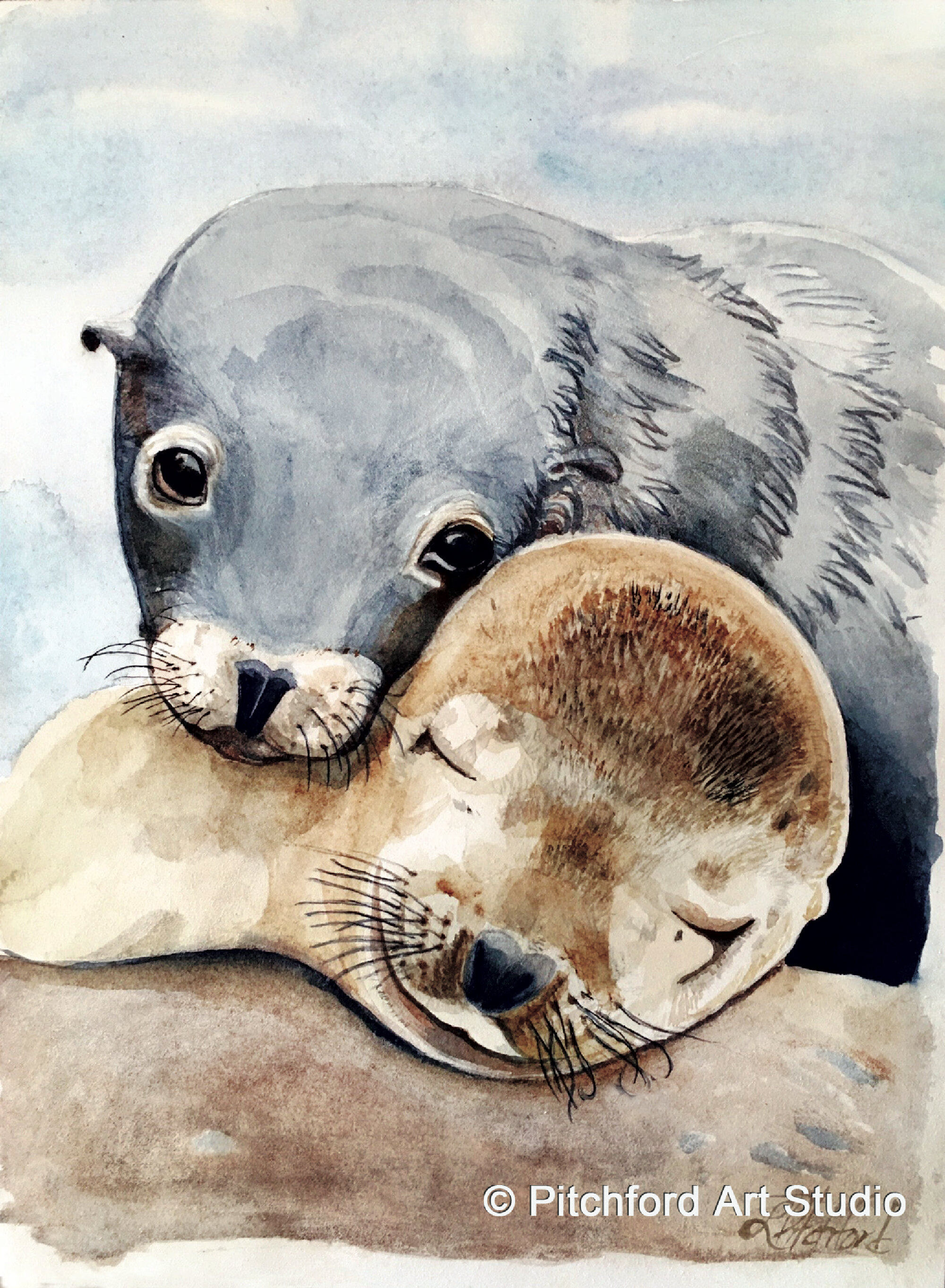
Seals and Black Oyster Catcher - prints can be purchased at - http://etsy.com/pitchfordartstudio

Seals and Black Oyster Catcher - prints can be purchased at - http://etsy.com/pitchfordartstudio
This image is of a beautiful journal created by Alena Kudriashova